Key technical setup I look for in trading
Trading is both an art and science, and each setup develops independently and uniquely


In this post, I will be sharing the key setup I look out for.
Essentially, the stock must exhibit the following characteristics before it is actionable:
Leading sector and/or leading stock (how to spot leading sectors and stocks)
Strong upside momentum
Contraction in price range and volatility
The first characteristic (leading sector and/or leading stock) has been covered in another post, where I have provided the link above.
Strong upside momentum
For the second characteristic, these are some forms of strong upside momentum:
Stock beats earnings and moves strongly higher on exceptional volume; better still if the stock puts in a strong move higher despite missing earnings. Price action takes precedence. Aside from earnings, other company-related catalysts are acceptable as well.
Stock puts in a strong run within a very short span of time. These strong run-ups may occur in heavily beaten-down names within a strong sector.
Stock breaks out of a massive base. The longer the base, the more explosive and robust the breakout.
Contraction in price range and volatility
The first two characteristics place a stock on my watchlist, but they may not be actionable just yet.
If the stock exhibits a contraction in price range and volatility, which leads to a clear pivot point to trade on, then the stock is actionable.
The whole point of having a tight price range and a clear tradable pivot point is such that you are able to place a stop loss at a tight and reasonable area. By “reasonable”, I mean that if the price visits that level, the chart would have soured, and I want to be stopped out of the trade.
A stop loss allows you to fix the max loss you will take if you get stopped out, while at the same time opening yourself up to unquantifiable upside gain. Assuming you fix an absolute $ loss you will take by placing a stop loss, then it follows that the tighter the stop loss, the larger the position size. This is an asymmetric reward-to-risk profile, and it is the key to profitability.
During a period where price range is contracting, I want to see the following characteristics:
Daily price range is getting increasingly smaller. I want to see increasingly narrow daily candlesticks, with an inside-day bar preferable. Inside-day bars represent pent-up pressure, with bulls and bears unable to move the stock in either direction.
Within the range that the stock is consolidating within, I want to see each successive peak-to-trough get shorter.
Ideally, near-term moving averages (10 and 20 day) would have caught up with the price, and are starting to serve as support.
During the consolidation phase, a clear pivot point starts to appear.
Price is making a series of higher lows, as it approaches the pivot point.
A pivot point is the “breakout” point. It is usually a level where price pushes above the recent consolidation range. Better still, if the pivot point is a clear straight line.
Once a pivot is clear, and when there is sufficient consolidation and tightening, I place an alert at the pivot level.
Price breaks above pivot
When price breaks above the pivot, the alert will go off. Ideally, leading up to the breakout day, many other stocks within the same sector are also setting up at the same time. This confluence adds strength to the breakout, as the stocks could break out in tandem.
When a stock pushes above the pivot point, it allows you to place a tight stop loss at a reasonable level. This is because if price retreats back below the pivot point, you are most likely wrong on the breakout. For that reason, I typically like to see tightening up just below the pivot point, instead of price having to run up a long way to clear the pivot.
The stop could be placed at the day's low, or a short distance below the pivot. There is no hard and fast rule on this. As long as the stop loss is reasonably tight, I am fine. I use an “average daily range” indicator on Tradingview, so if the stop exceeds the average daily range, that means the stop might be too wide.
Examples
There could be many variations of the same setup, as each setup develops differently each time. That is why trading is both an art and science, and I prefer to assess the setup based on whether it checks off as many characteristics as possible. It is not possible to only trade perfect 5-star setups where every item on the checklist is cleared.
At the end of the day, we have to think in terms of probabilities, and accept that stop losses are part of the game. Over time, if I trade the same setup over and over again, how much reward can I extract relative to a unit of risk (max loss based on the stop loss)?
These are some examples:
Upstart
During the 2021 bull market, there were three possible areas to enter UPST. The stock would have made it to the watchlist when it beat earnings in March 2021, where the stock climbed more than +150%. However, it would not be actionable till August 2021 (first consolidation).
Daily Chart: UPST

In the first consolidation phase, UPST was tightening tremendously for weeks. It crept above the clear pivot line before earnings, which would have made it difficult for one to take the trade due to the event risk. This is because the stock could gap up higher or lower after earnings, so a tight stop would not make sense.
The second consolidation phase provided a second chance to enter the stock. Now, the chart is even more developed. It has broken out from a multi month base after earnings. Price was making higher lows while surfing the 10 day moving average (red line). There was an inside-day bar on 1 September just below the pivot line.
The third consolidation phase occurred as the stock is on its third leg up. The uptrend is a little old, but still tradable. Once again, stock was making higher lows while surfing the 10 and 20 day moving averages (red and purple lines). Two narrow range bars formed on 8 and 11 October, thereby forming a clear pivot line.
The stock peaked in October 2021, and is now down more than -97% from the peak. The landslide would have been avoided, as long as one uses a stop loss.
Tesla
Back in 2019, TSLA would have made it to the watchlist after it reported earnings in October, beating estimates by a whopping +542%, and rallying more than +30% on high volume in 3 days. It would not have been actionable right away.
Daily Chart: TSLA

The first consolidation phase occurred in November. Frankly, the setup was at best a 3-star one, as the 20 day moving (purple line) was still a fair distance behind and the stock had only consolidated for a few days. What was going for the stock was the fact that it broke out from a big multi month base post-earnings. As you may see, there is no certainty that a weak setup will fail, or a good setup will succeed. Trading is an art where you have to assess various pluses and minuses.
In any case, the second consolidation was better. In December, TSLA built a tight flag at the 10 and 20 day moving averages (red and purple lines), and broke out from it on 9 December.
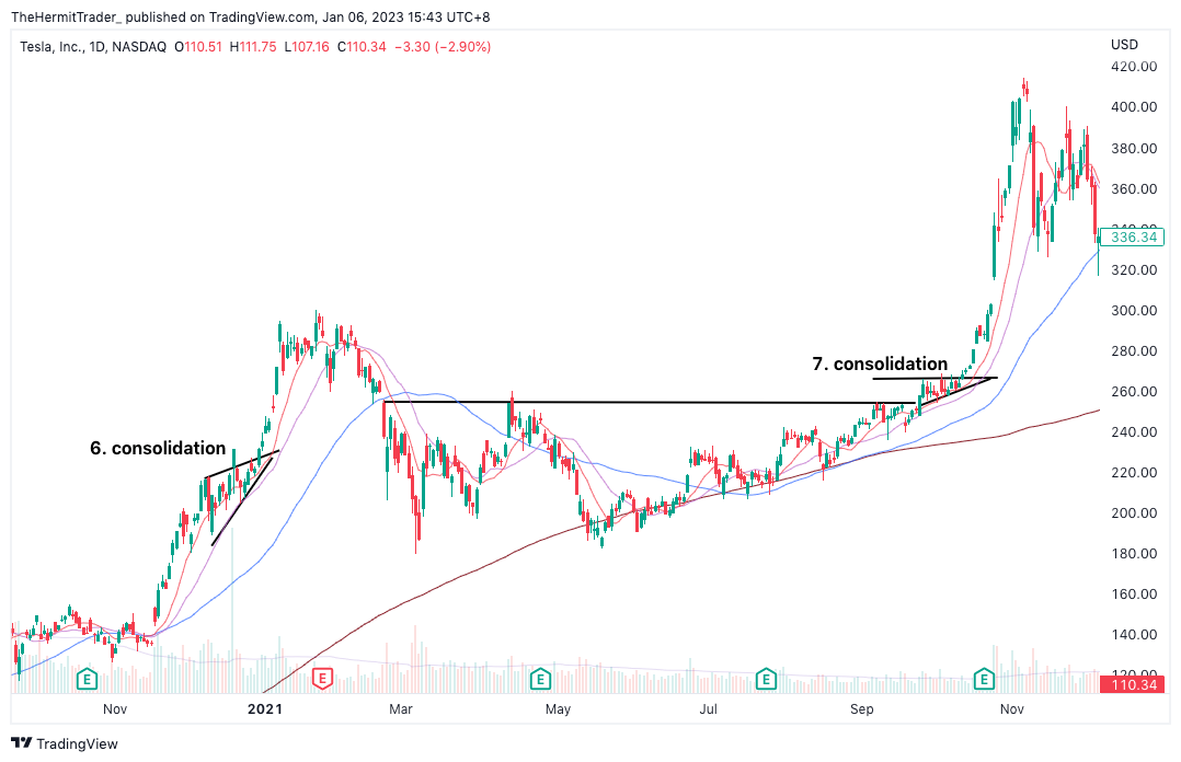
The below continuation chart of TSLA shows why we should not get impatient and FOMO. The next 3 consolidation phases would have taken place months away, but the market still provides a chance to re-enter.
Daily Chart: TSLA

The third consolidation is at best a 2-star setup. There is some semblance of tightness, but the fact that the stock had gone parabolic + the bearish gap-up failure on 4 February serve as warning that the stock might be over extended. The fourth and fifth consolidation phases both look decent.
The sixth consolidation phase in TSLA took place in December 2020, and the seventh took place in October 2021, which was 5-star in my opinion as it took place right above the neckline of a multi month base.
Daily Chart: TSLA